The Scripps Research Institute "All of Us"
Case Study
My Role:
- User Experience
- UI Design
- Information Architecture
- Strategy
The Challenge:
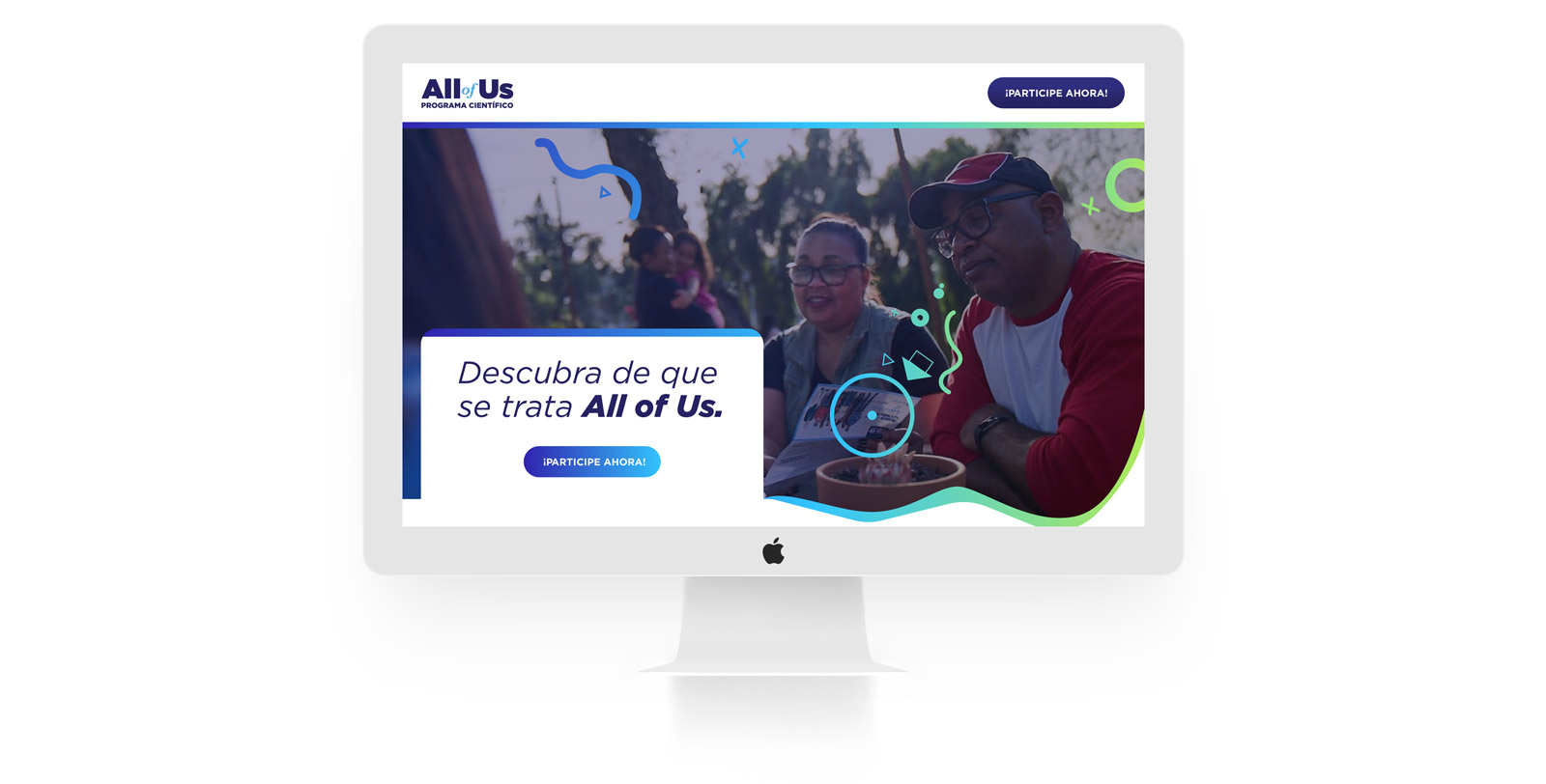
The winter of 2018 I took a 3/month contract position to assist The Scripps Research Institute(TSRI) team to simplify and assist with user adoption and enhance their targeting in the latino community for one of their largest government projects with the National Institute of Health's (NIH) research program, called “All of Us”.
The Goal:
The “All of Us” project was not getting the forecasted number of user sign-ups and retention – which was a big burden for TSRI in keeping their NIH government contract. We came to a conclusion that if we could simplify the sign-up process and target an untouched latino market we could meet the forecasted user enrollments.
My Process: 🕵🏻
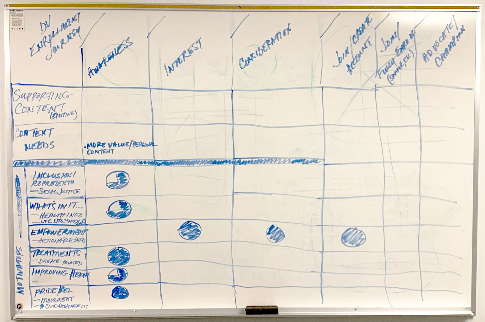
I had the opportunity to work on a lot of different projects during my time there. Regardless of the objective I always hit pen & paper or a whiteboard first. Like any great UX’er – in order to build your synthesis you must utilize the proper methods. Using the “Five W’s and How”(5W1H) will allow you to figure things out pretty quickly before jumping on your computer/laptop. Why am I building this? Who am I building it for? When and Where will it be used? What am I building? How could I measure it?
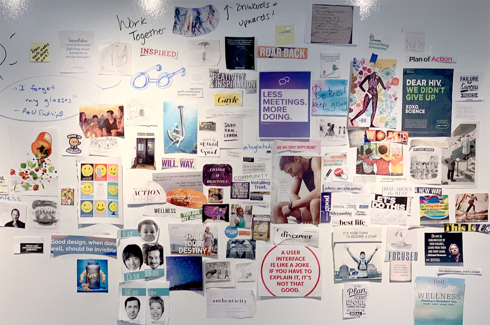
MORE WHITEBOARD SESSIONS: 👨🏻🔬
When working in a team, getting out all thoughts and describing the problem and possible solutions on paper or whiteboard helps ensure everyone is on the same page and leaves no stone unturned.
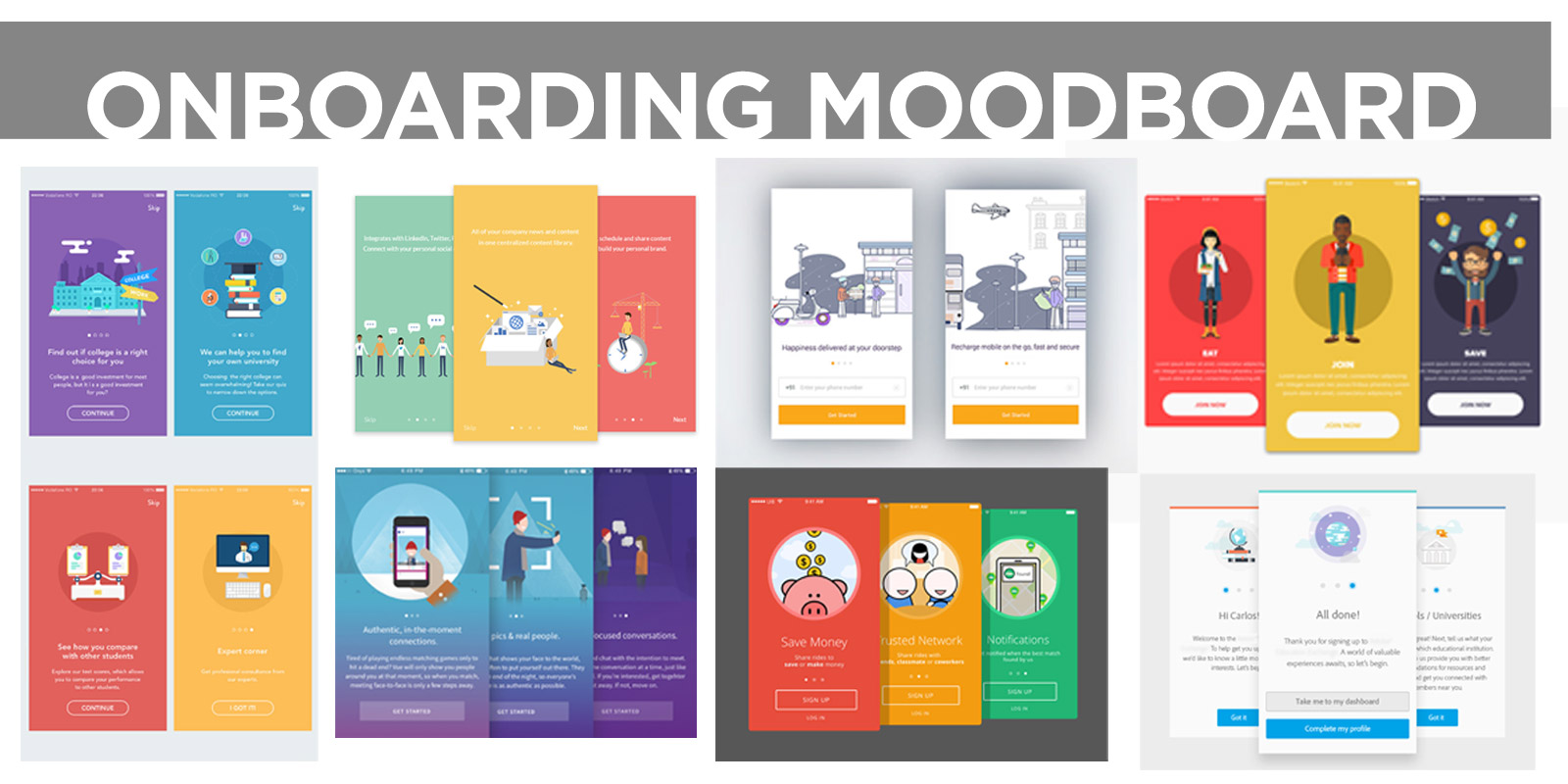
MOOD BOARDS GET THE CREATIVE JUICES FLOWIN: 🎨
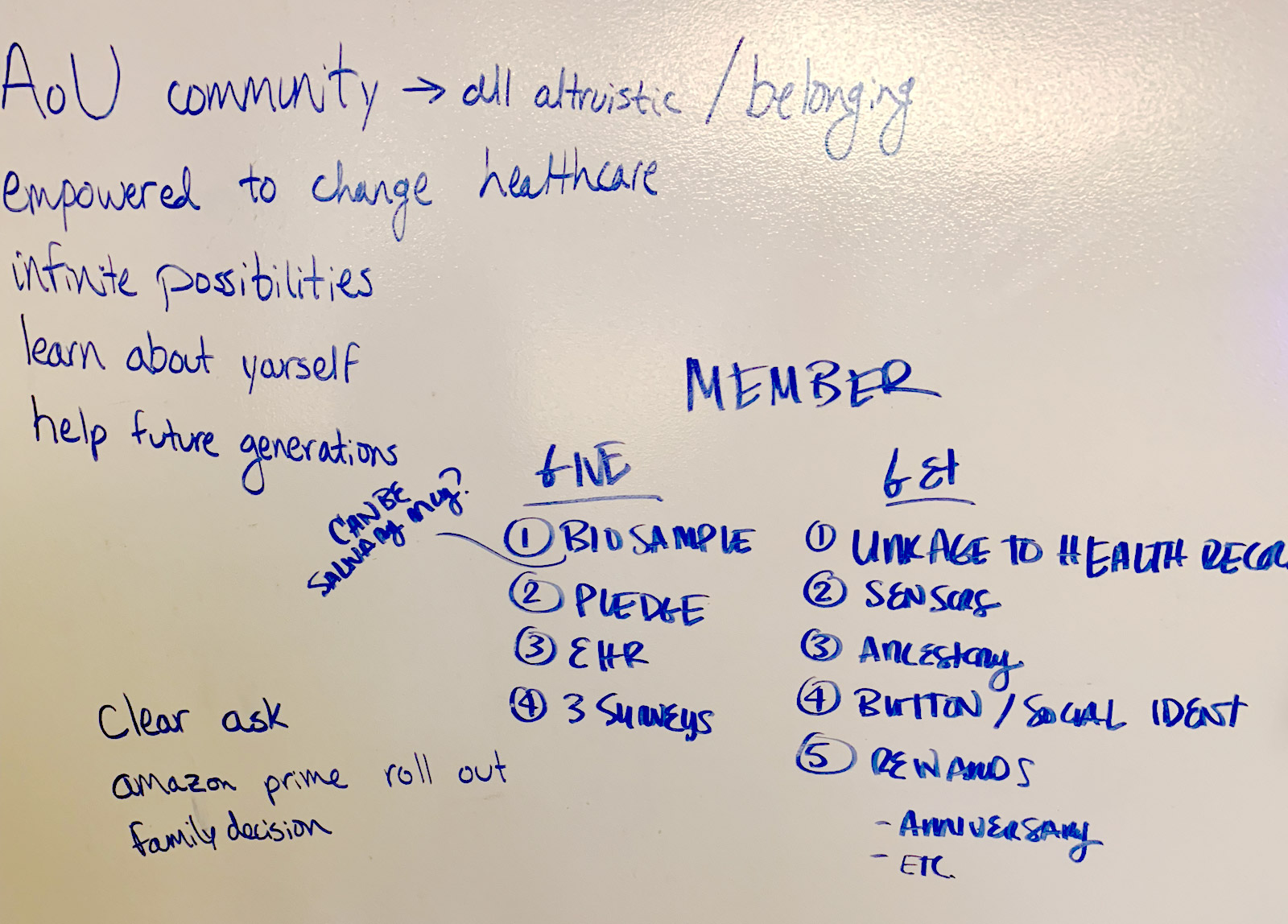
While working with Project Managers, Account Managers, & Producers it’s not always easy to get them to explain their design ideas since most are not as creative and artistic visually. Having collaborative mood board sessions brought out a visual explanation of what I was trying to achieve and also allowed them to interact in the early stages.
Lo-Fi Wireframes Before the Masterpiece: 👨🏻🎨
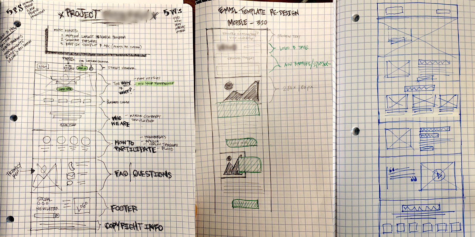
Now that I knew where to take the design I began to sketch lo-fi wireframes to get upper management to approve the content architecture. This helps with stakeholder approval and allows me to jump into a design without having to reposition content later once I’m working on hi-fidelity mocks.
The Solution: ✍🏻
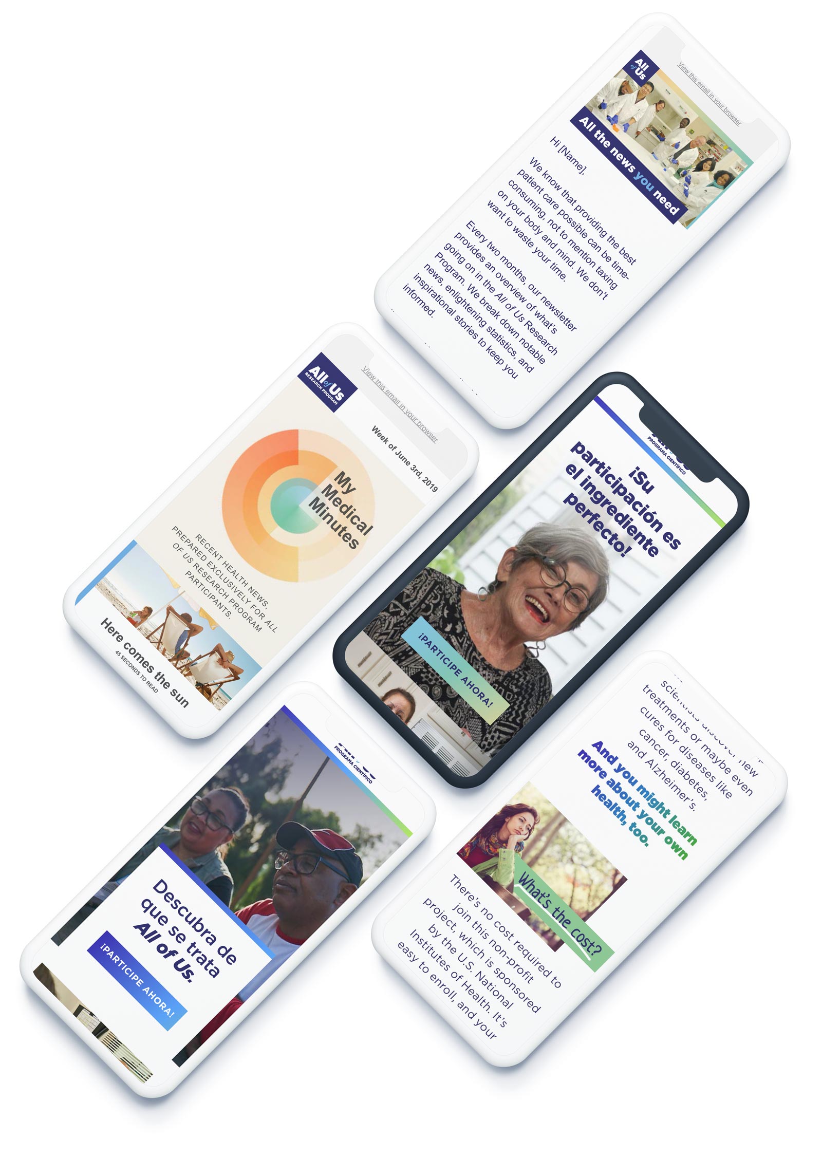
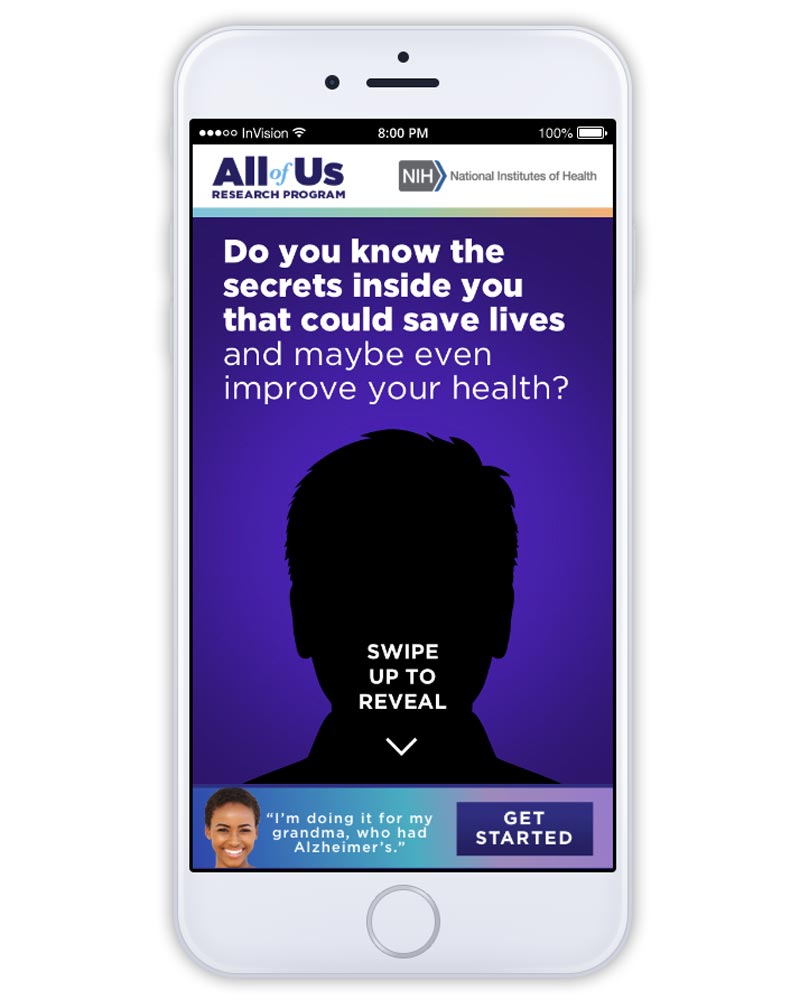
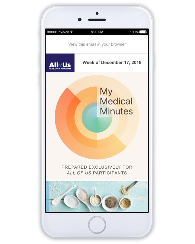
After reviewing data based on important business KPIs I was able to make informed decisions on what was working and how to suggest making changes or adding to our online marketing efforts — like making all touch points cohesive and uniformed to not alienate the user. A lot of our current strategy wasn’t aligned with our current design style guide from the look and feel perspective. This is when I started to design reusable email templates, reusable website UI’s themes, and marketing collateral to ensure we got the branding on point for other departments within the program, since there were lots of silos.
The Outcome: 🥳
In conclusion, I turned my 3/month contract into 7/months. During that time I was able to optimize the UX for user registrations which increased sign-ups by 1.5x. We also were able to garnish a 20% increase in the latino market. Email campaigns and online advertising touchpoints had a 3% higher open rate and helped drive traffic and over all sign-ups.
Mobile App UI Prototype
Email Campaign Prototype
More Recent Work
Sony Electronics

SD Custom Footwear
